

.png)
21 Email Popup Examples That Actually Convert And How to Automate Them in 2026
Finding high-quality email popup examples that genuinely work can be a challenge. In 2026, a user's attention is more valuable than ever, and a poorly designed popup is a fast track to a closed tab. However, a strategic email capture popup is still one of the most powerful tools for growing your email list, generating leads, and driving sales. The key is to offer real value and create a seamless user experience. This article explores 21 inspiring examples and shows you how to automate the crucial follow-up communication that turns a new subscriber into a loyal customer.
What Makes an Email Popup Successful in 2026?
Before diving into the best email pop up examples, it's essential to understand the principles that separate a high-converting popup from an annoying one. Success isn't about flashy animations; it's about a strategic exchange of value. A popup is a conversation starter, and these core elements ensure it begins on the right foot.
- Value-Driven Offer: The single most important factor is what you offer in exchange for an email address. A generic "Join our newsletter" is no longer enough. The offer must be compelling, whether it's a 15% discount, an exclusive guide, a free template, or early access to a sale. The value must be immediate and clear to the user.
- Context and Timing: A great popup appears at the right moment. An exit-intent popup that offers a discount to a user leaving their cart is highly contextual. A welcome popup offering a guide after a user has read a related blog post is perfectly timed. Avoid showing a popup the second a user lands on your site; give them time to understand your brand first.
- Compelling Design & Copy: Your popup should be an extension of your brand. Use your brand's colors, fonts, and tone of voice. The headline should be attention-grabbing, the body copy should clearly explain the benefit, and the call-to-action (CTA) button should be impossible to miss. Keep the copy concise and persuasive.
- Frictionless User Experience: Make it incredibly easy to sign up. Only ask for the information you absolutely need, which is often just an email address. The popup should be easy to close, responsive on all devices, and should not disrupt the user's ability to browse your site. The best email signup popup examples feel helpful, not intrusive.
The Best Email Popup Examples, Categorized by Goal
Now, let's explore some of the most effective pop up form examples from leading brands. We've categorized them based on their primary marketing objective to help you find the perfect inspiration for your own strategy.
1. Popups for Growing Your Newsletter List
These popups focus on the long-term value of your content, persuading users that your newsletter is worth their time. The goal is to build a community of engaged subscribers.
Example 1: The New Yorker's Simple & Direct Approach
The New Yorker's popup is a masterclass in minimalism. It often features a clean design, a compelling headline about their award-winning journalism, and a single field for an email address. It works because it's on-brand, direct, and focuses entirely on the quality of the content the subscriber will receive. Visit them at The New Yorker.
Example 2: Morning Brew's Content-First Offer
Morning Brew built its entire business on its newsletter. Their email capture popup doesn't offer a discount; it offers a smarter way to start your day. The copy clearly outlines the benefit: "Get the daily email that makes reading the news actually enjoyable." This is a powerful promise that attracts their ideal audience. Find them at Morning Brew.
Example 3: The Hustle's Social Proof Popup
Leveraging social proof is a classic marketing tactic that works wonders for email popups. The Hustle's popup often includes a line like "Join 2 million+ readers getting our daily tech and business news." This simple statement reduces friction by showing visitors that many others already trust and value the content. See their site at The Hustle.
Example 4: MeUndies' Playful Welcome
Your popup's tone should match your brand. MeUndies uses fun, cheeky copy and vibrant visuals in their popups to engage users. Instead of a bland "Subscribe," their CTA might say "I Want In." This playful approach makes the exchange feel less transactional and more like joining a fun club. Check them out at MeUndies.
2. Popups for Driving Sales with Discounts
For e-commerce brands, a well-timed offer can be the perfect nudge a potential customer needs to make their first purchase. These newsletter signup examples are all about immediate gratification.
Example 5: Madewell's First-Time Shopper Discount
This is one of the most common and effective pop up form examples. Madewell often greets new visitors with a clean popup offering 10% or 15% off their first order in exchange for their email. It's a straightforward value exchange that incentivizes both a signup and a purchase. Visit them at Madewell.
Example 6: Fabletics' Gamified "Spin-to-Win"
Gamification can dramatically increase engagement. Fabletics uses an interactive "spin-to-win" wheel popup where users enter their email for a chance to win various discounts, from 10% off to 50% off. It's fun, interactive, and makes users feel like they've earned their reward. See it at Fabletics.
Example 7: Brooklinen's Exit-Intent Cart Saver
An exit-intent popup is designed to catch visitors who are about to leave your website. Brooklinen triggers a popup when a user with items in their cart moves their cursor to close the tab. The popup might say, "Wait! Complete your order now and get $20 off." This is a powerful tool for reducing cart abandonment. Find them at Brooklinen.
Example 8: Rothy's Free Shipping Offer
Unexpected shipping costs are a major reason for cart abandonment. Rothy's overcomes this objection by offering free shipping on the first order for users who sign up for their email list. This popup removes a common purchasing barrier and captures a lead simultaneously. Check out their site at Rothy's.
Example 9: Glossier's Exclusive Access Popup
Exclusivity is a powerful motivator. Glossier uses popups to offer early access to new product drops or limited-edition sales for their email subscribers. The fear of missing out (FOMO) encourages signups from their most enthusiastic fans and customers. Visit them at Glossier.
3. Popups for Generating High-Quality Leads
For SaaS, B2B, and service-based businesses, the goal is often to capture leads with high purchase intent. This is achieved by offering valuable, non-product resources.
Example 10: HubSpot's Ebook Download
HubSpot is the king of content marketing. They offer incredibly valuable resources like ebooks, guides, and reports as lead magnets. Their email popup examples are clean, benefit-driven, and clearly state what the user will get by downloading the resource in exchange for their email and other qualifying information. Find their resources at HubSpot.
Example 11: Salesforce's Webinar Signup Form
Webinars are an excellent way to capture high-quality leads. Salesforce uses popups to promote upcoming webinars featuring industry experts. The popup acts as a registration form, capturing leads who are actively seeking knowledge and solutions in their industry. See their events at Salesforce.
Example 12: Asana's Free Template Offer
Offering a practical tool is a fantastic lead generation strategy. Asana might use a popup on a blog post about project management to offer a "Free Project Plan Template." This provides immediate value and captures a lead who is already interested in their solution. Check them out at Asana.
Example 13: Typeform's Interactive Quiz
Interactive content is highly engaging. Typeform could use a popup that invites users to take a short quiz, such as "What's Your Team's Communication Style?" To get the personalized results, the user must enter their email address. This is a fun and effective way to capture leads and segment them based on their answers. Visit them at Typeform.
4. Unique & Creative Popup Form Examples
These examples break from the traditional center-screen popup mold, using creative formats to capture attention without being overly disruptive.
Example 14: Warby Parker's Multi-Step Form
Instead of presenting all form fields at once, a multi-step popup reduces initial friction. Warby Parker might first ask a simple yes/no question like "Want to find your perfect frames?" When the user clicks "Yes," the form then shows the email input field. This uses the psychological principle of consistency to increase conversions. See their approach at Warby Parker.
Example 15: Neil Patel's Full-Screen Welcome Mat
A welcome mat is a full-screen popup that appears when a visitor lands on a page. While it can be more intrusive, it's also impossible to ignore. Neil Patel uses this effectively to promote a high-value offer like a webinar or a new tool. This format should be used sparingly and only with a truly compelling offer. Find his site at Neil Patel.
Example 16: Trello's Non-Intrusive Slide-In
A slide-in popup is a more subtle alternative. As a user scrolls down a page, a small box slides in from the bottom corner. Trello might use this on a features page to suggest signing up for a newsletter with productivity tips. It's less disruptive than a traditional popup and feels more like a helpful suggestion. Check them out at Trello.
Example 17: Backlinko's "Yes/No" Form
This two-step opt-in form uses psychology to its advantage. Brian Dean at Backlinko presents two choices. For example: a big, enticing button that says "Yes, Show Me The SEO Tips!" and a small, plain text link below that says "No, thanks. I don't want to rank higher." This frames the decision in a way that makes clicking "yes" the obvious, desirable choice.
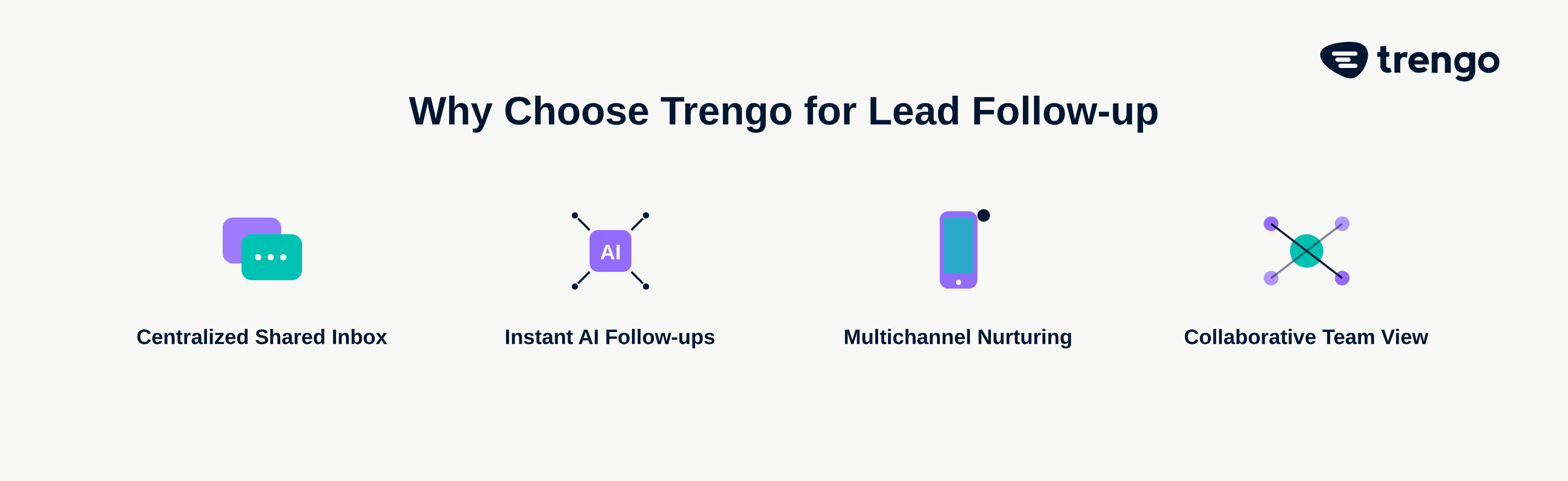
Beyond the Signup: How to Automate Your Welcome Sequence with Trengo
Capturing an email address with a great popup is just the first step. The real magic happens in the moments that follow. A fast, relevant, and personalized follow-up is critical for turning that new subscriber into a customer. This is where a smart customer engagement platform like Trengo transforms your lead capture process into a streamlined revenue engine.
Centralize Every New Lead in a Shared Inbox
When a user signs up, where does that lead go? In many companies, it ends up in an isolated list, invisible to the sales and support teams. With Trengo, every new subscriber can be automatically routed into Trengo's Omnichannel inbox. This gives your entire team a unified view of every new lead, ensuring no opportunity is missed and follow-ups are handled promptly and collaboratively.
Use Rules and Flowbots for Instant, Personalized Follow-Ups
The moment someone signs up is when they are most engaged. You need to capitalize on this with an immediate response. Using Trengo's AI automations like Rules and Flowbots, you can trigger an instant, personalized welcome email. This could deliver their discount code, link to the ebook they requested, or simply welcome them to the community. This first interaction is crucial for setting the tone of the entire customer relationship.
Create a Multichannel Nurture Journey
Why limit your communication to just email? With Trengo, you can create a truly omnichannel nurture sequence. Imagine this flow: a user signs up via your website popup. They instantly receive their 10% discount code via email. The next day, you can automatically send a follow-up welcome message via WhatsApp, asking if they have any questions about your products. This proactive, multichannel approach meets customers on their preferred channels, boosts engagement, and is all managed and automated from a single platform.
Frequently Asked Questions
The 5 C's of email marketing are a framework for creating effective campaigns. They stand for Content (what you send), Context (why you're sending it now), Cadence (how often you send), Channel (ensuring email is the right channel for the message), and Conversion (the desired action you want the user to take).
The best pop-ups are those that provide clear value to the user in a way that is not overly disruptive. They are contextually relevant, appear at the right time (like on exit-intent), have a compelling offer, feature a clean design with persuasive copy, and are incredibly easy for the user to either complete or close.
Ten popular types of marketing and transactional emails include: Welcome Emails, Newsletters, Promotional Offers, New Product Announcements, Lead Nurturing Emails, Re-engagement Campaigns, Abandoned Cart Emails, Order Confirmations, Shipping Notifications, and Customer Feedback Requests.
The 60/40 rule is a common guideline for email marketing content strategy. It suggests that 60% of your emails should provide value to your audience through helpful content, tips, or entertainment, while only 40% should be directly promotional or sales-focused. This helps build a stronger relationship with your subscribers and prevents list fatigue.
Making an email signup form "pop up" on a website is done using specialized tools or platforms for lead capture. These tools use JavaScript to display a form based on specific triggers you define. Common triggers include time spent on page, scroll depth (e.g., after a visitor scrolls 50% down the page), or exit-intent, which detects when a user is about to leave the site.